Brand elements
A consistent and cohesive visual identity creates a sense of recognition and trust, which can ultimately lead to greater brand affinity. Consistency in design elements such as colours, fonts, and imagery will help our community recognize and recall Haskayne's messaging and initiatives.
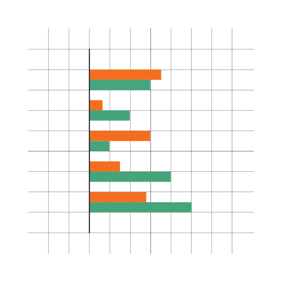
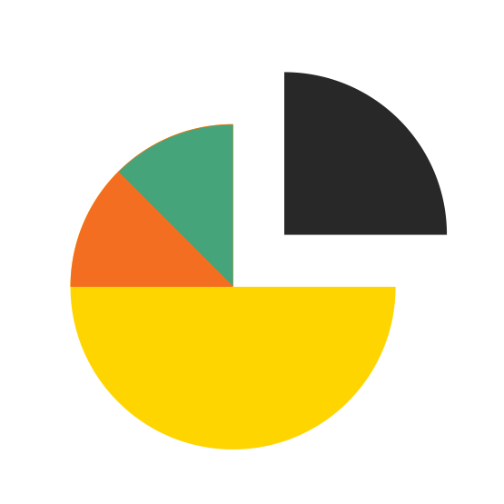
For imagery, Haskayne has introduced the H monogram, new organic shapes and graphic elements to further bring the brand to life. The H monogram is ideal for small spaces that won't fit the logo such as in social media thumbnails. The organic shapes bring to life the sense of transformation and entrepreneurial energy that we embrace at Haskayne. The charts, graphs and infographics are custom designed to help tell quick messages in a cohesive design.
H monogram
The Haskayne H was designed as a stand-alone monogram for specific usage. Social media profile icons and conference thumbnails tend to be small square or circles that are not suitable for the Haskayne logo, in these cases the H monogram may be used. Other usage includes where the full Haskayne name is not necessary and a bold graphic can help make a statement and create brand recognition:
- social media profile thumbnail
- conference thumbnails
- clothing or merchandise - this should be designed and ordered by the Haskayne MarCom team only
Note: the monogram should never appear in an application that has the Haskayne logo to avoid duplication.
Graphic elements
The concepts of transformative change, growth and leadership are communicated with supporting brand graphics. Bold organic, abstract shapes reference ideas, creativity and entrepreneurial drive. Soft abstract landscape forms represent Haskayne’s distinct location in Calgary, Alberta. These branding elements, paired with the colour palette and typography, create a unified brand experience for Haskayne.
These graphic elements have been created into templates, you'll see them in social media, powerpoints, posters, post cards, flyers and more.
Cropped shapes



Landscapes



Charts, graphs, infographics
When creating assets such as charts, graphs or infographics, it’s best to use simple geometric-style shapes. Use colours defined in the Haskayne palette to create unity and cohesion. Charts, graphs and infographics can be used in presentations, social posts and print materials, where applicable.
